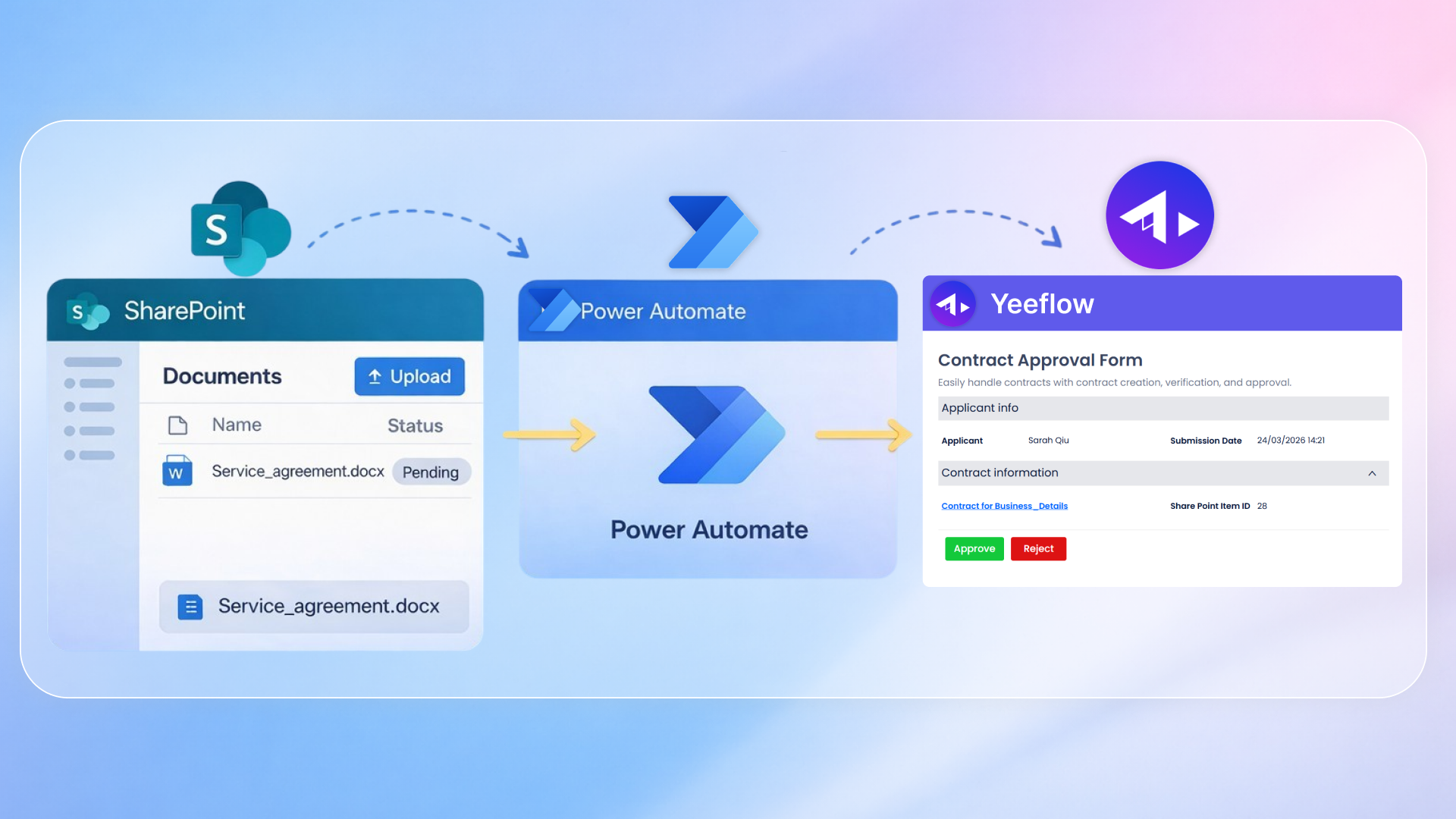

We’ve redesigned the Form Designer and Workflow Designer to make building in Yeeflow (YeeOffice) feel cleaner, more consistent, and easier to use—especially when your forms and workflows become more complex. The goal of this update is not to change how creators build, but to improve how the experience flows: where tools live, how quickly you can find key functions, and how readable your work remains as it grows.
This article walks through the new Form Designer experience first, then the Workflow Designer, and finally two additional improvements: the new way to access Navigator and the upgraded workflow connector lines.
A cleaner and more focused Form Designer
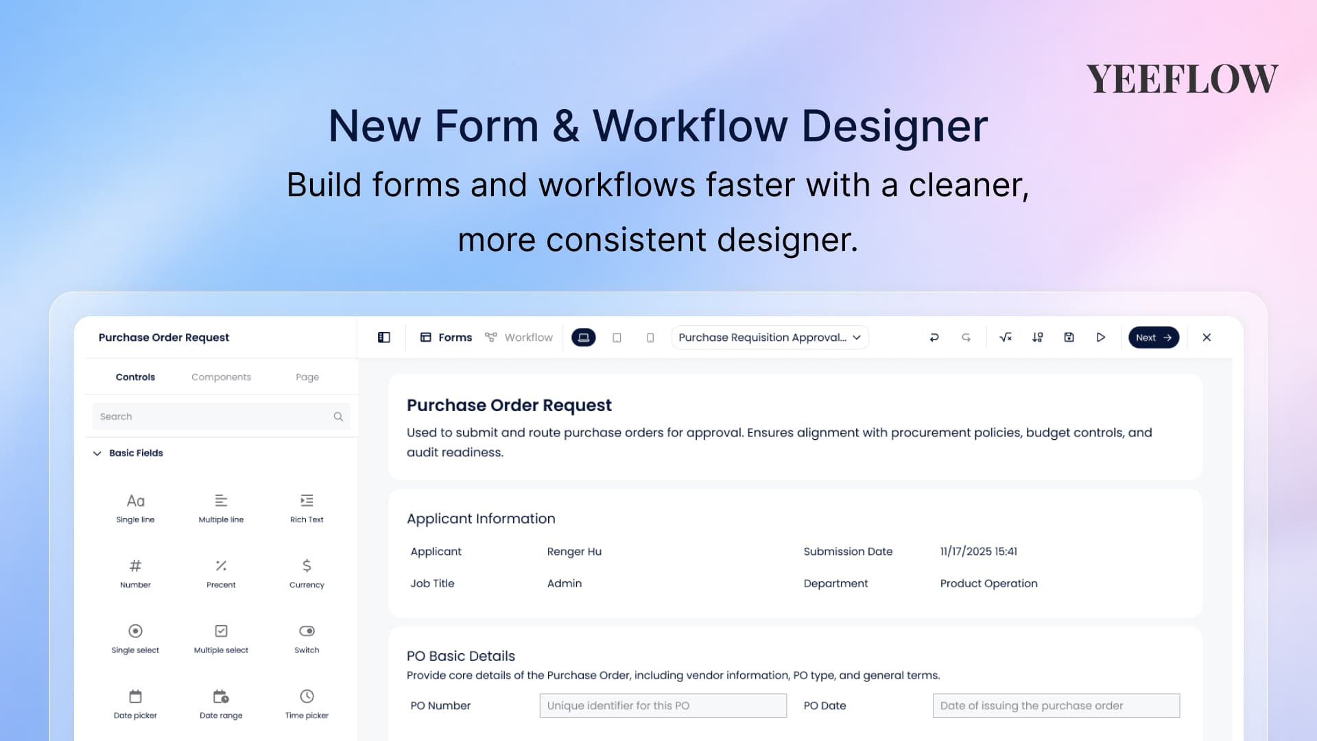
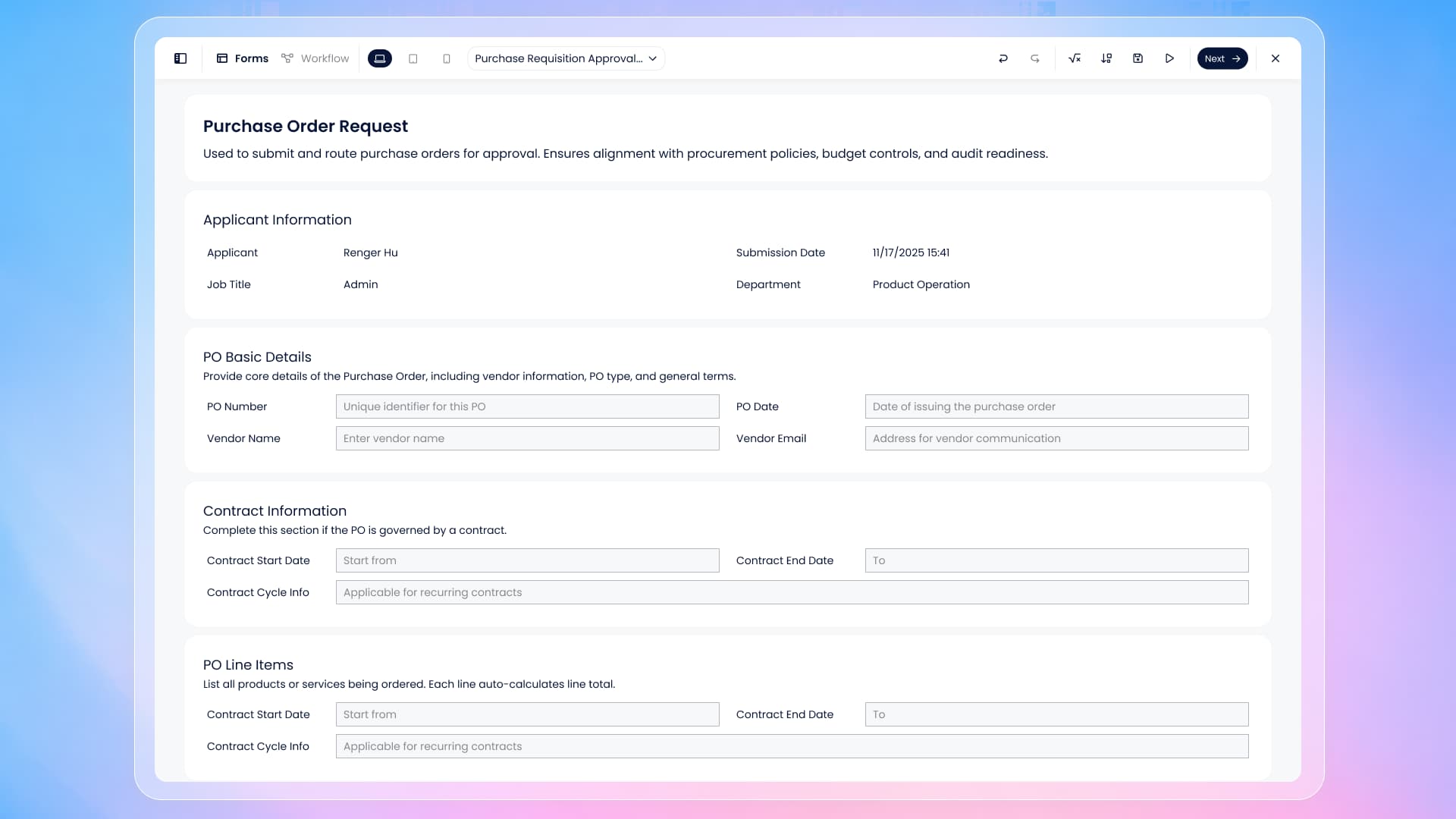
The first thing you will notice in the new Form Designer is that the workspace feels more open and structured. The canvas is given more visual emphasis, and the interface is calmer—so you spend less time scanning the screen and more time designing. While the overall layout has been refreshed, the logic remains familiar: you build with resources on the left, design in the center, and use top-level tools to manage editing and configuration.
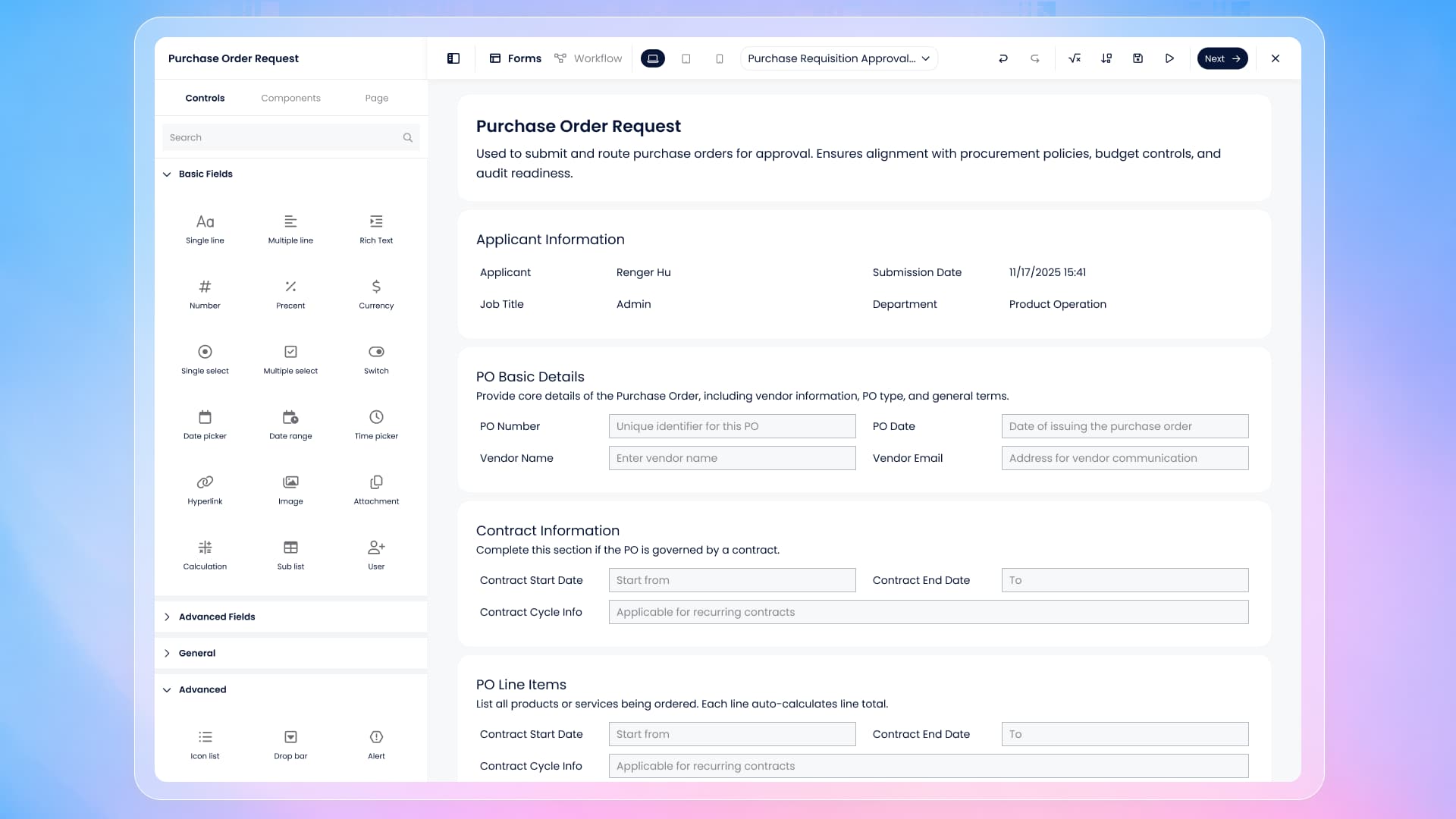
When you’re building, you can still work with standard form controls in the left panel. What’s improved is how the designer guides you toward more reusable and scalable building patterns. In addition to Controls, the left panel now lets you switch to Components more easily, so you can incorporate reusable blocks—whether they are prebuilt components, shared elements, or custom components created by your team. This is especially helpful when you want consistent layouts across multiple forms or across an entire application.
The designer also makes it easier to focus on layout work. When you need more space, you can collapse the left operation panel using the top-left toggle. This expands your canvas area and reduces distractions, which is particularly useful when adjusting multi-column sections, fine-tuning spacing, or working on forms that contain many components.
Navigating and managing forms is now more straightforward
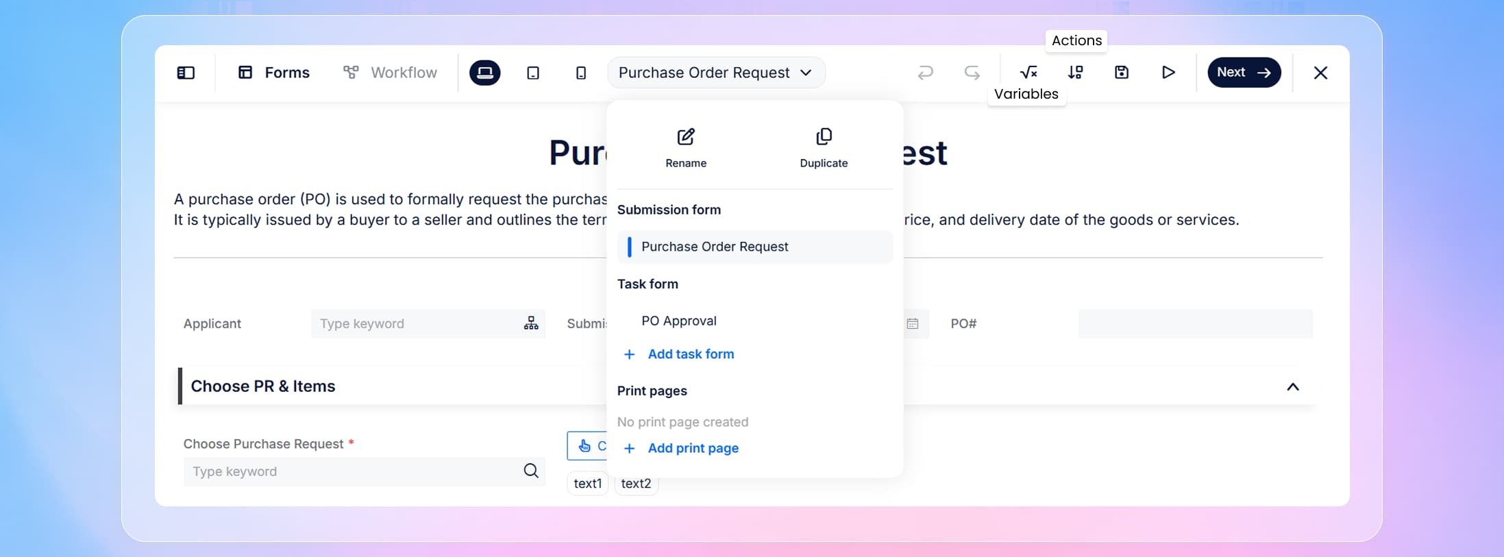
In many real-world applications, you are not building only one form. You may maintain multiple forms for different steps, different roles, or different data entry scenarios. To support that, the new designer provides a clearer way to understand where you are and what you’re editing. The Forms dropdown shows your current position, and it also provides a more direct workflow for creating new forms and managing existing ones without breaking your design flow.
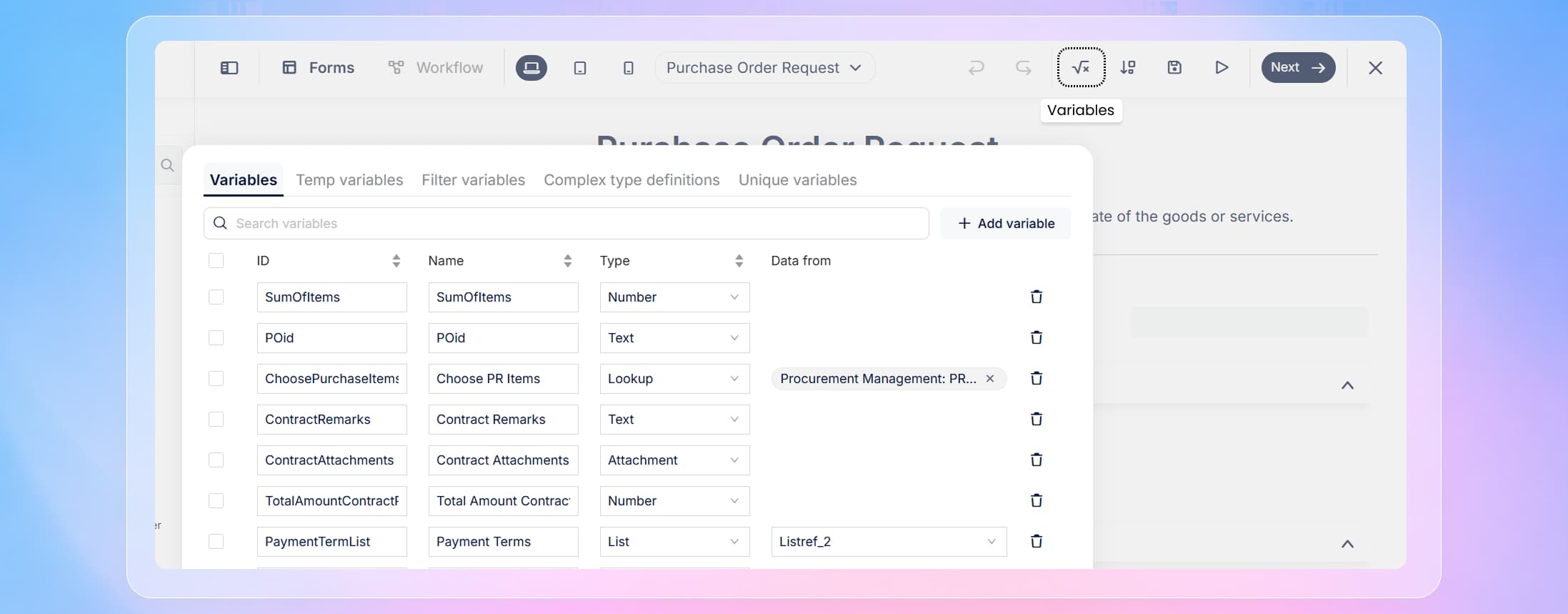
Alongside navigation improvements, the top toolbar has been reorganized so that key tools are easier to access and follow a consistent pattern. Undo and redo remain immediately available, helping you iterate quickly as you design. From there, the tools that creators frequently need—Variables and Actions—are clearly exposed, so you no longer need to hunt for them while working.
When you open Variables, the designer presents a dedicated variable management window that centralizes variable creation and maintenance. After you finish reviewing or editing, you can confirm and return directly back to the designer.
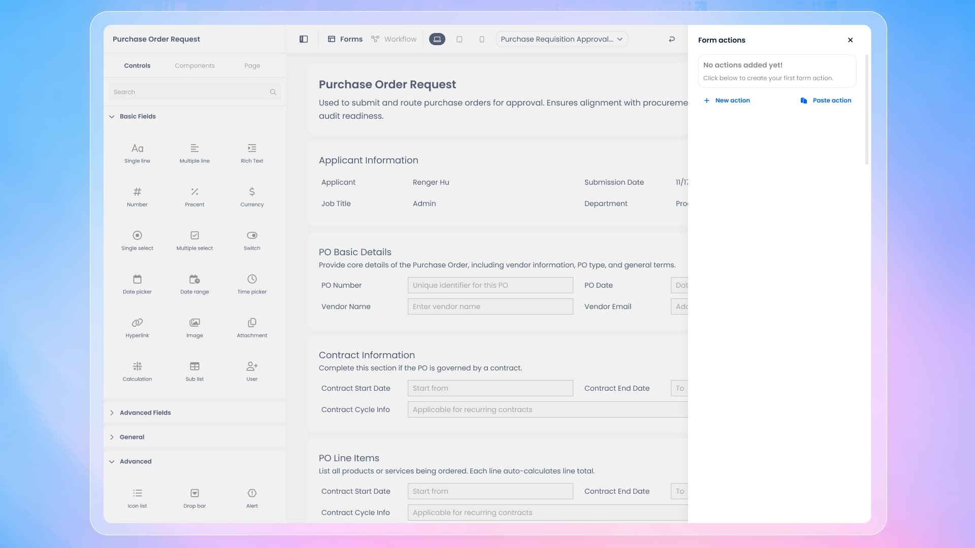
Similarly, Actions opens a dedicated panel for form actions, where you can create and manage actions in a focused space without leaving your current context.
After Actions, you will also find Save and Preview grouped with the main design operations. Save ensures your latest changes are recorded, while Preview lets you validate the form experience quickly before you move forward or switch to workflow design.
Navigator is now accessed in a cleaner way, and the experience is improved
In the previous designer, Navigator was placed as a button at the bottom-left of the interface. In the new design, we removed that fixed button to reduce visual clutter and reserve the main interface for higher-frequency design operations.
Navigator is still available, but the access method is now more aligned with how creators use it. When you want to inspect structure or jump between nested containers, you can right-click directly in the designer and select Navigator from the pop-up menu. This approach keeps the interface clean while still allowing quick access when you need to understand or navigate complex structures.
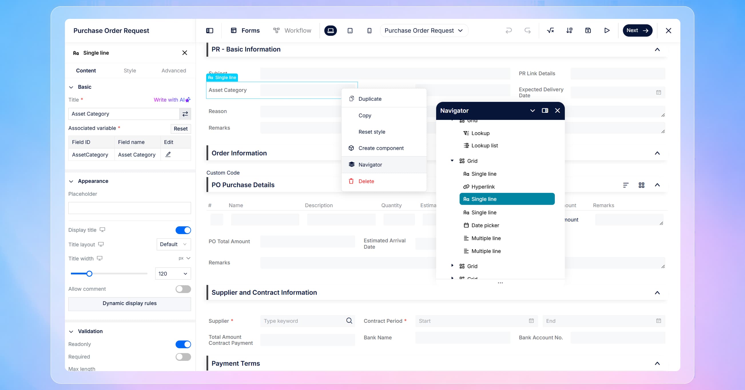
In addition to the entry change, the Navigator panel experience itself has been improved. This makes it easier to work with complex, nested layouts and to locate containers or sections when you are building large forms.
A redesigned Workflow Designer with clearer canvas control
After completing form design, creators typically move to workflow design, and the Workflow Designer has been refreshed with the same principles: clarity, readability, and consistency.
The workflow canvas is now more visually focused, and operational controls have been moved to the bottom. This design choice improves readability because it reduces competition between the workflow diagram and the tool controls. When your workflow has multiple branches or many steps, this layout helps you track the process more easily and edit without distraction.
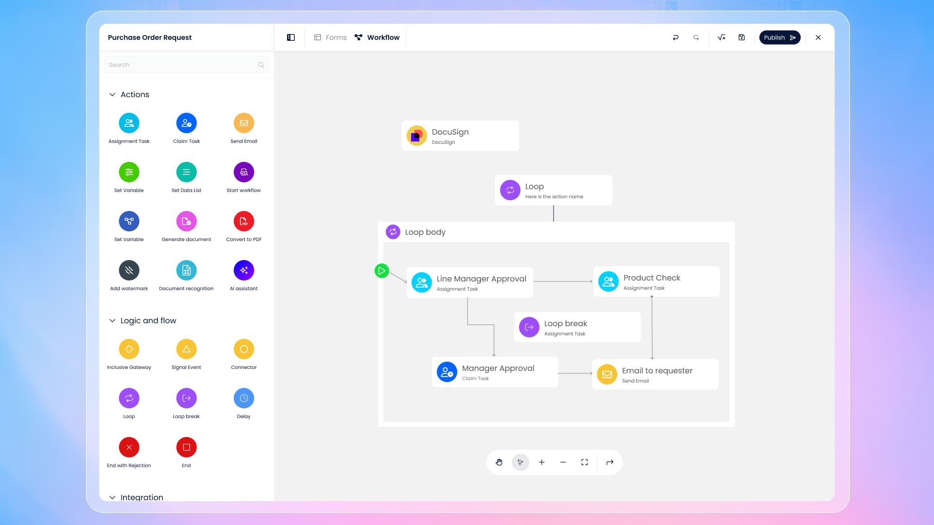
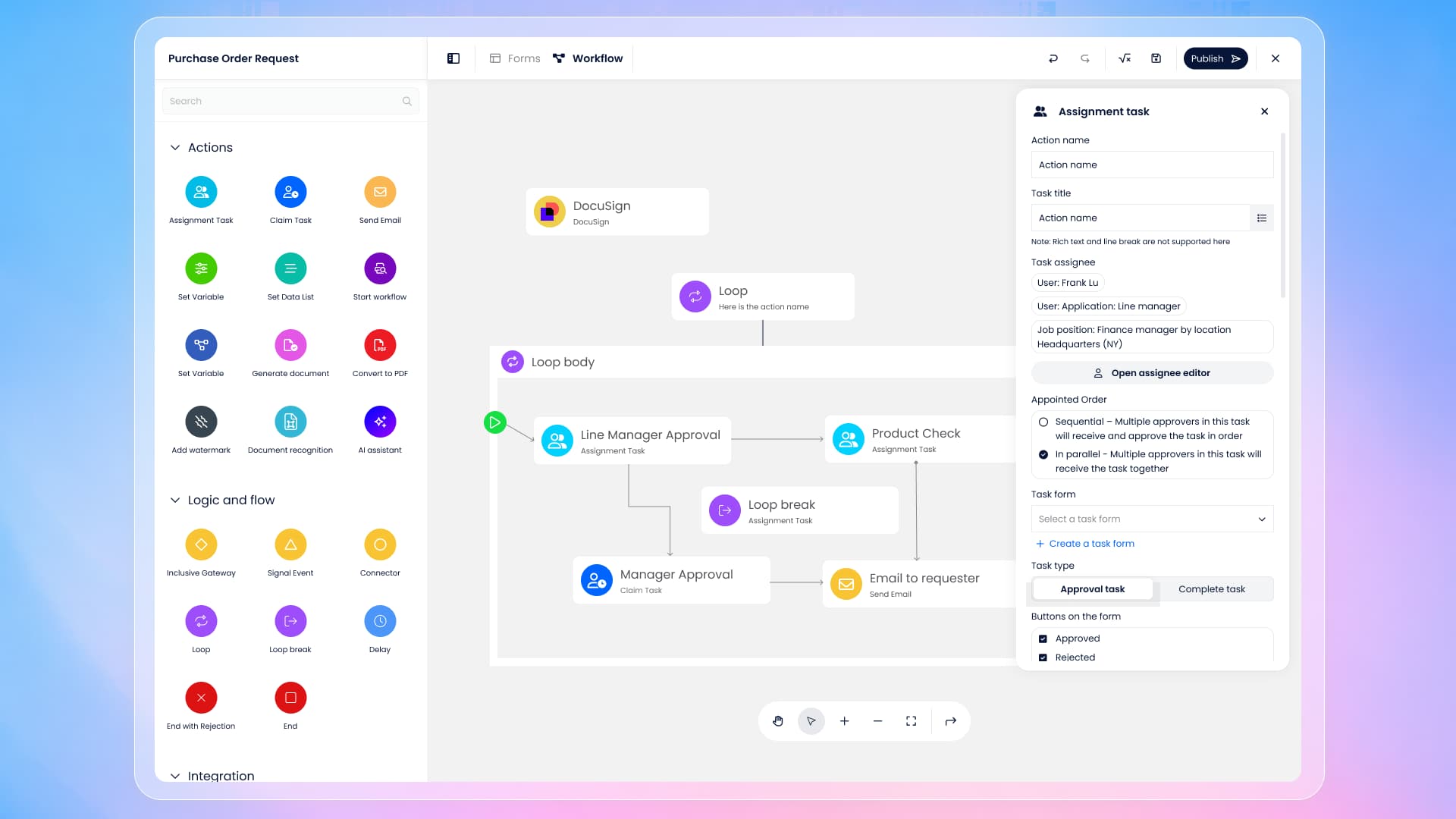
When you click into any workflow action—such as an Assignment Task—the settings panel opens with the redesigned interface. The purpose of this change is to make configuration for each workflow action clearer and more consistent, so creators can update settings more efficiently and with less cognitive load. The panel is designed to support a smooth “select → configure → continue building” rhythm as you work through the workflow.
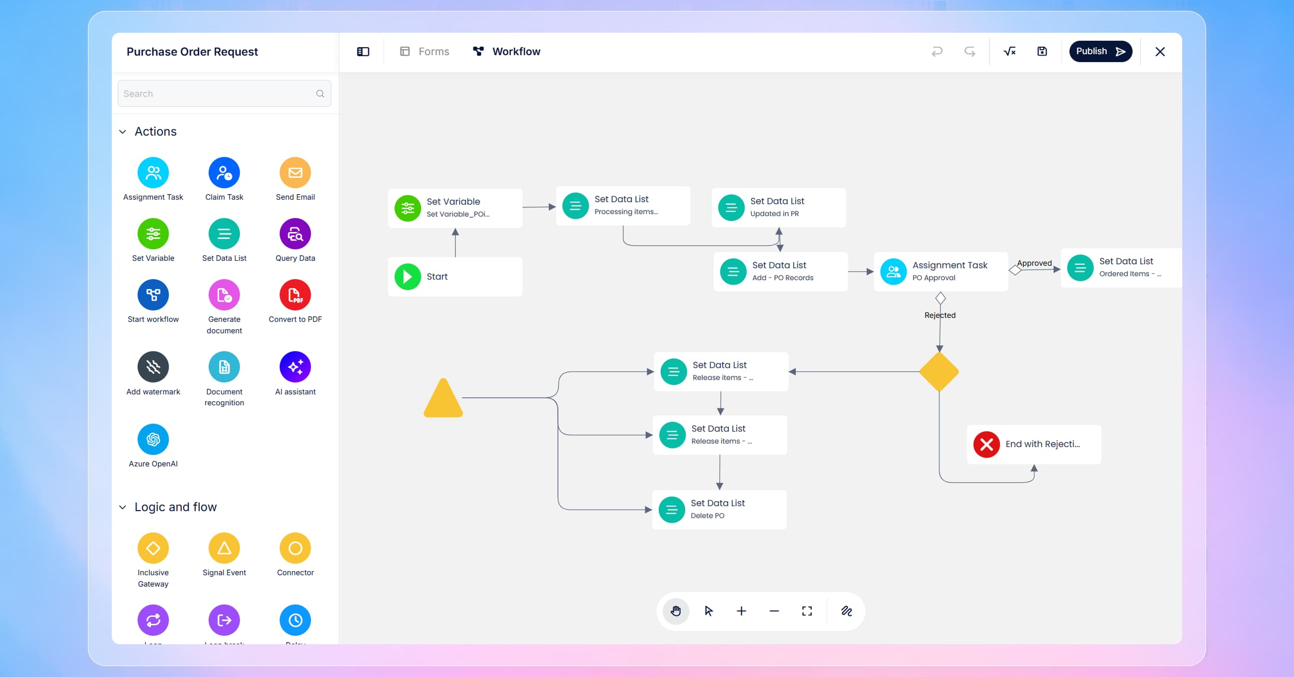
Workflow connector lines are now easier to read
One of the most noticeable workflow improvements is the way connector lines are drawn between actions. In the previous designer, connector lines used right-angled routing. In more complex workflows, those right-angled lines often overlaid on other actions or crossed through crowded areas, which made the diagram harder to read.
In the new designer, connector lines have been updated to rounded routing and smarter connection behavior. The lines are more visually natural, and routing reduces unnecessary overlap. The result is a workflow diagram that remains readable even as it grows in complexity, making reviews and maintenance easier for both creators and stakeholders.
Summary
This redesign brings a cleaner, more consistent building experience across both the Form Designer and Workflow Designer. The Form Designer is easier to focus on, provides clearer access to Components, and offers more direct workflows for navigation, variables, actions, saving, and previewing. Navigator remains available but is now accessed through right-click, with an improved panel experience. The Workflow Designer is visually clearer, places operational controls at the bottom, introduces a redesigned settings panel for workflow actions, and improves diagram readability with rounded and smarter connector lines.